Green & Black’s Smooth
The Opportunity
Green & Black’s came to us with an opportunity to entice new consumers into their Organic Chocolate range by recruiting dark aspirants (people who want to eat more dark chocolate but don’t purchase as they think it will be too bitter / intense).
‘Smooth Dark’, a 50% cocoa chocolate, needed to sit within Green and Blacks Organic tablet range between the Milk and Intense Dark products but feel different enough to be entice the new consumers.
Services
- Brand Strategy
- Packaging Design
Wildly Smooth
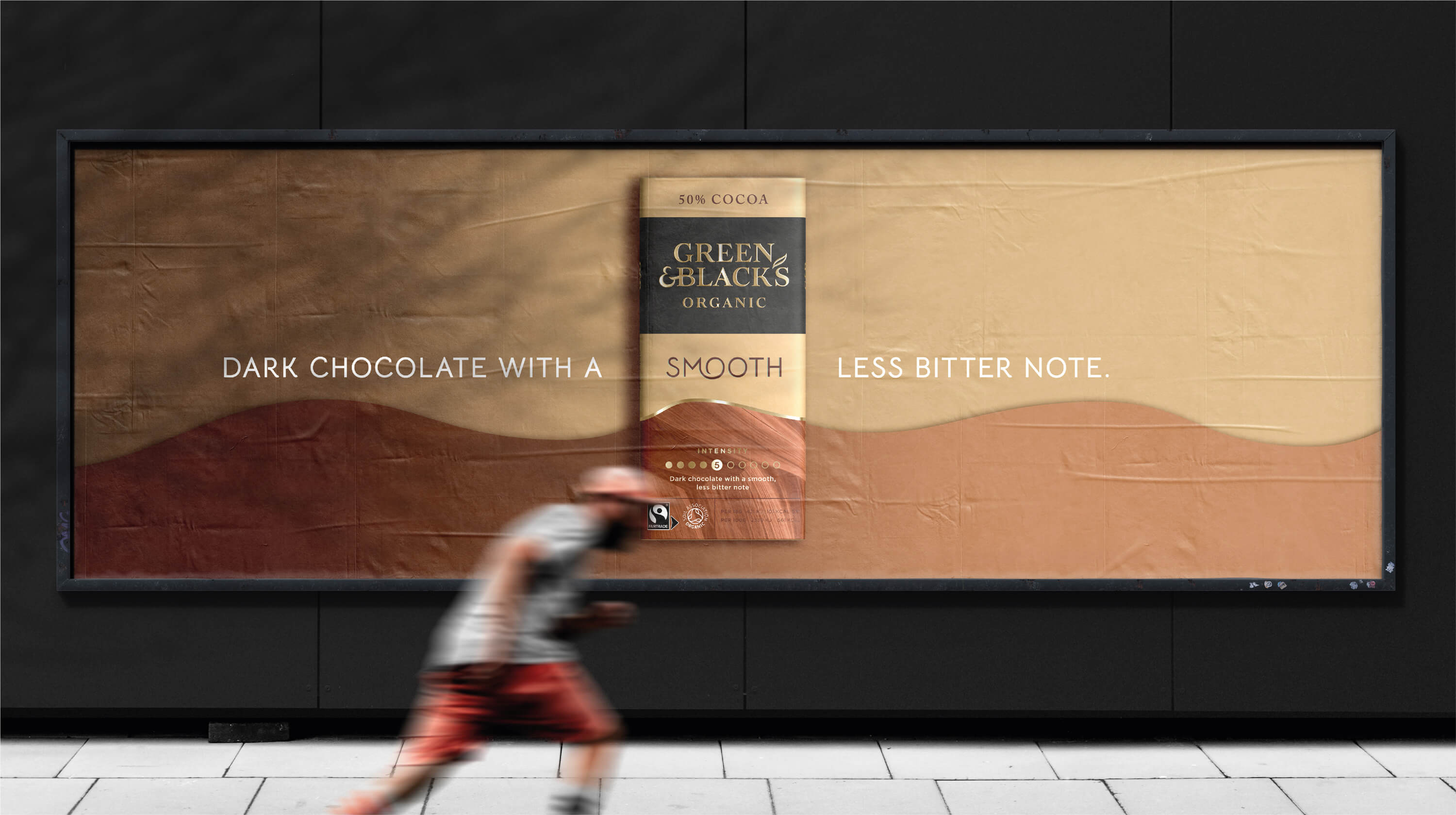
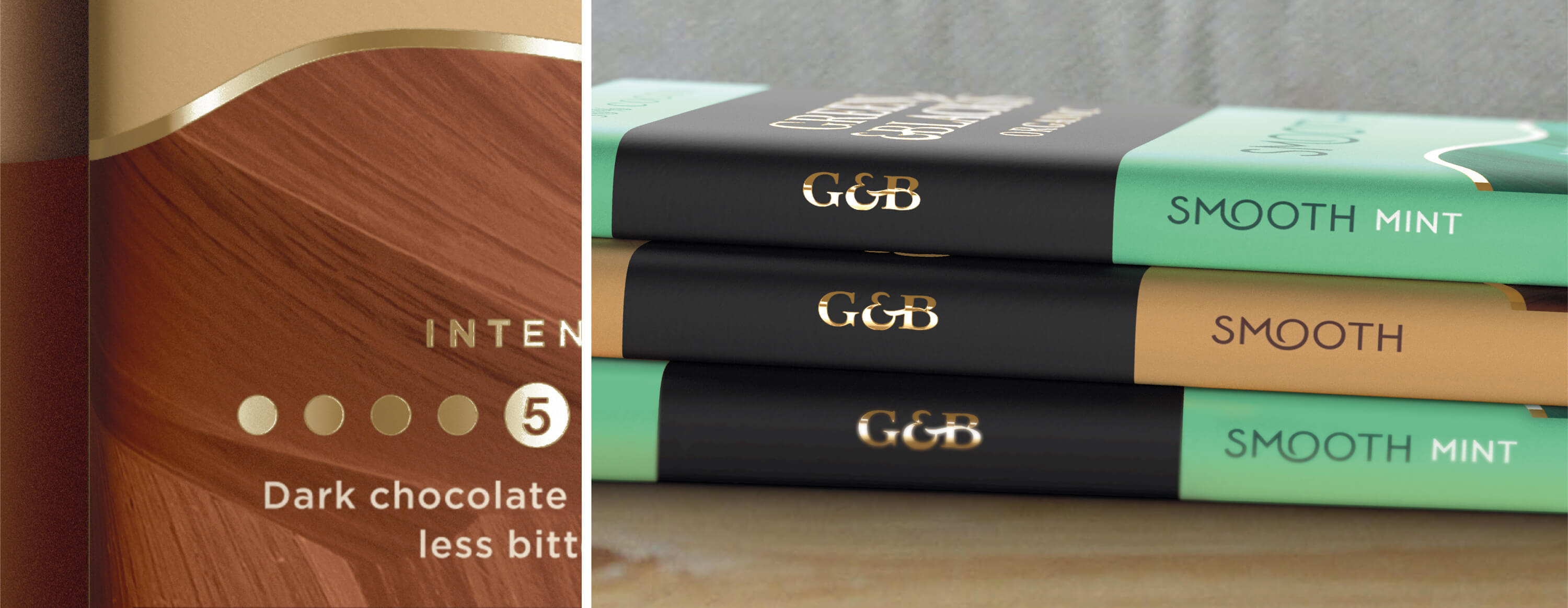
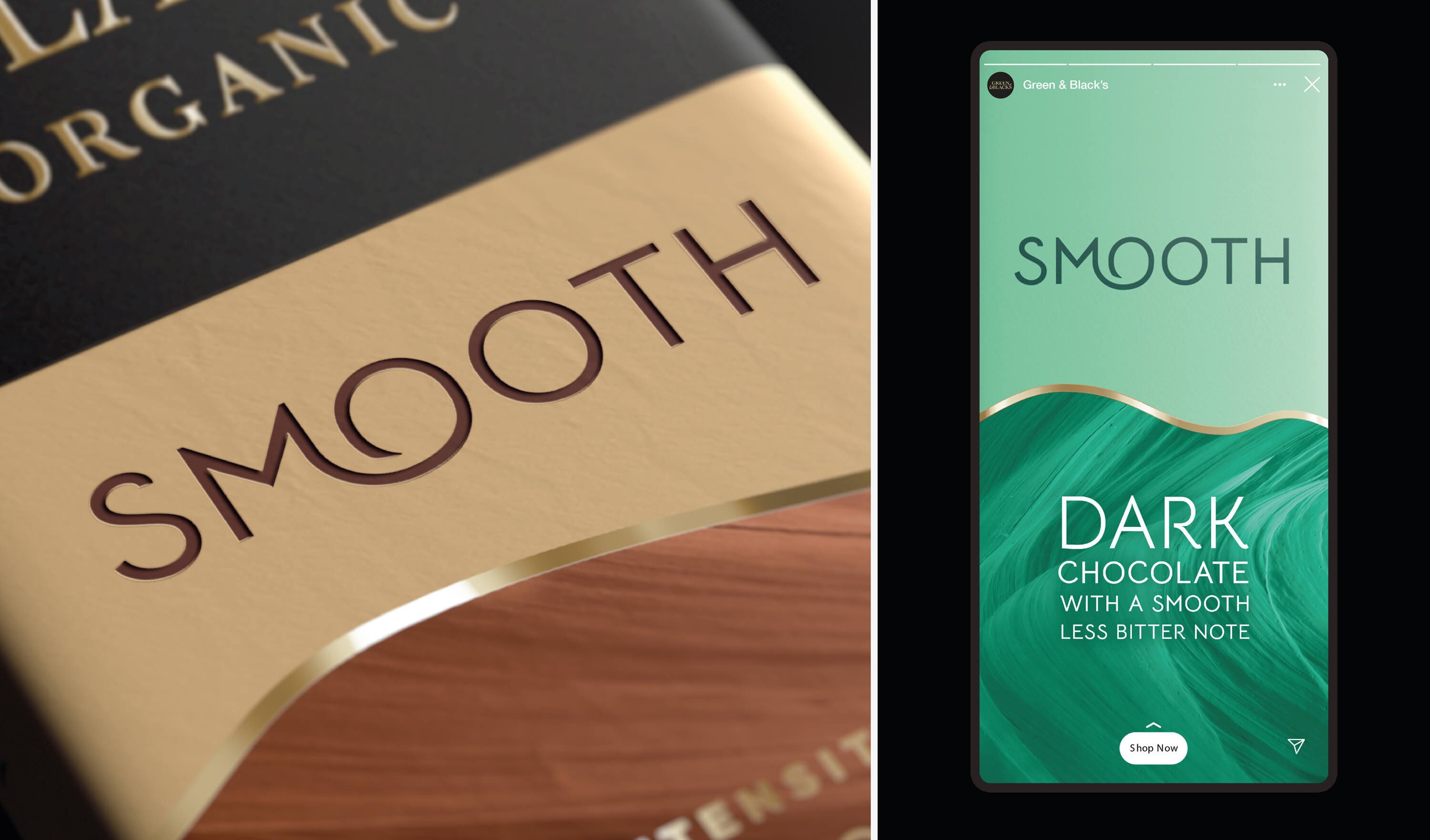
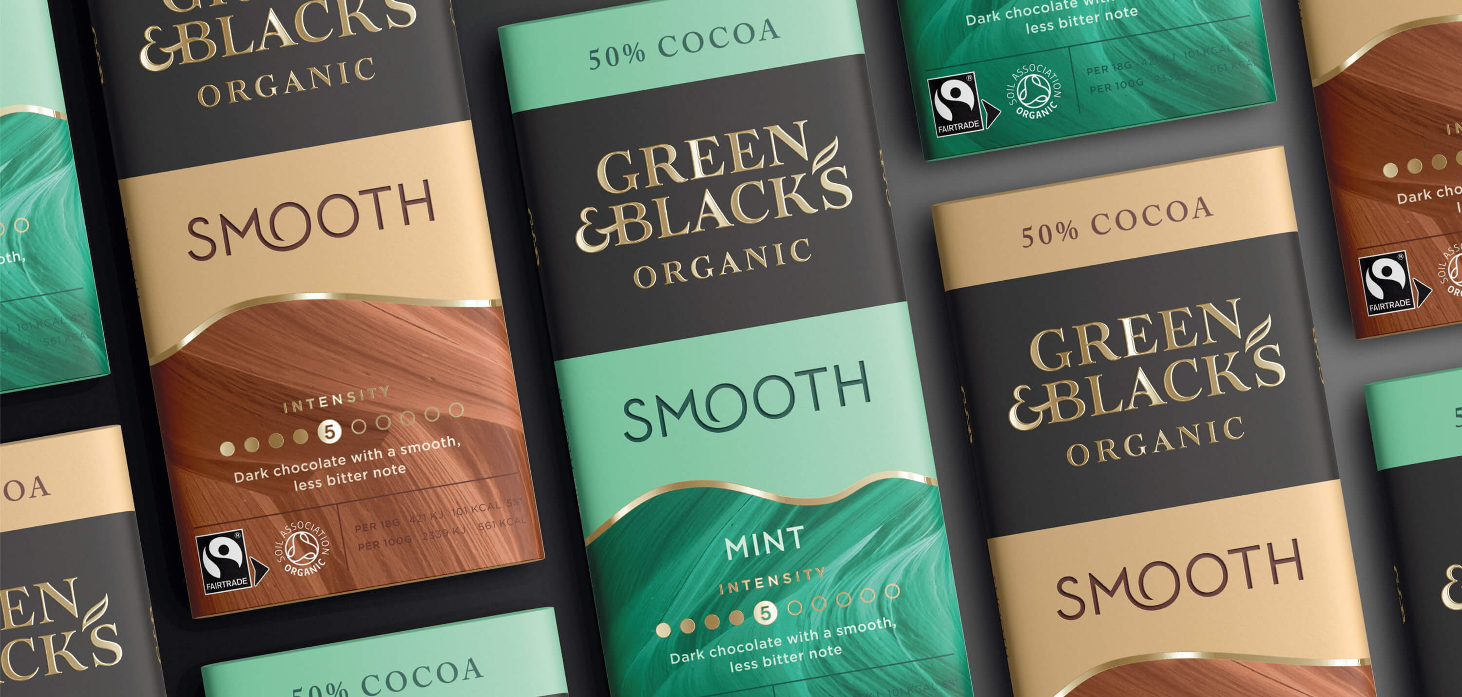
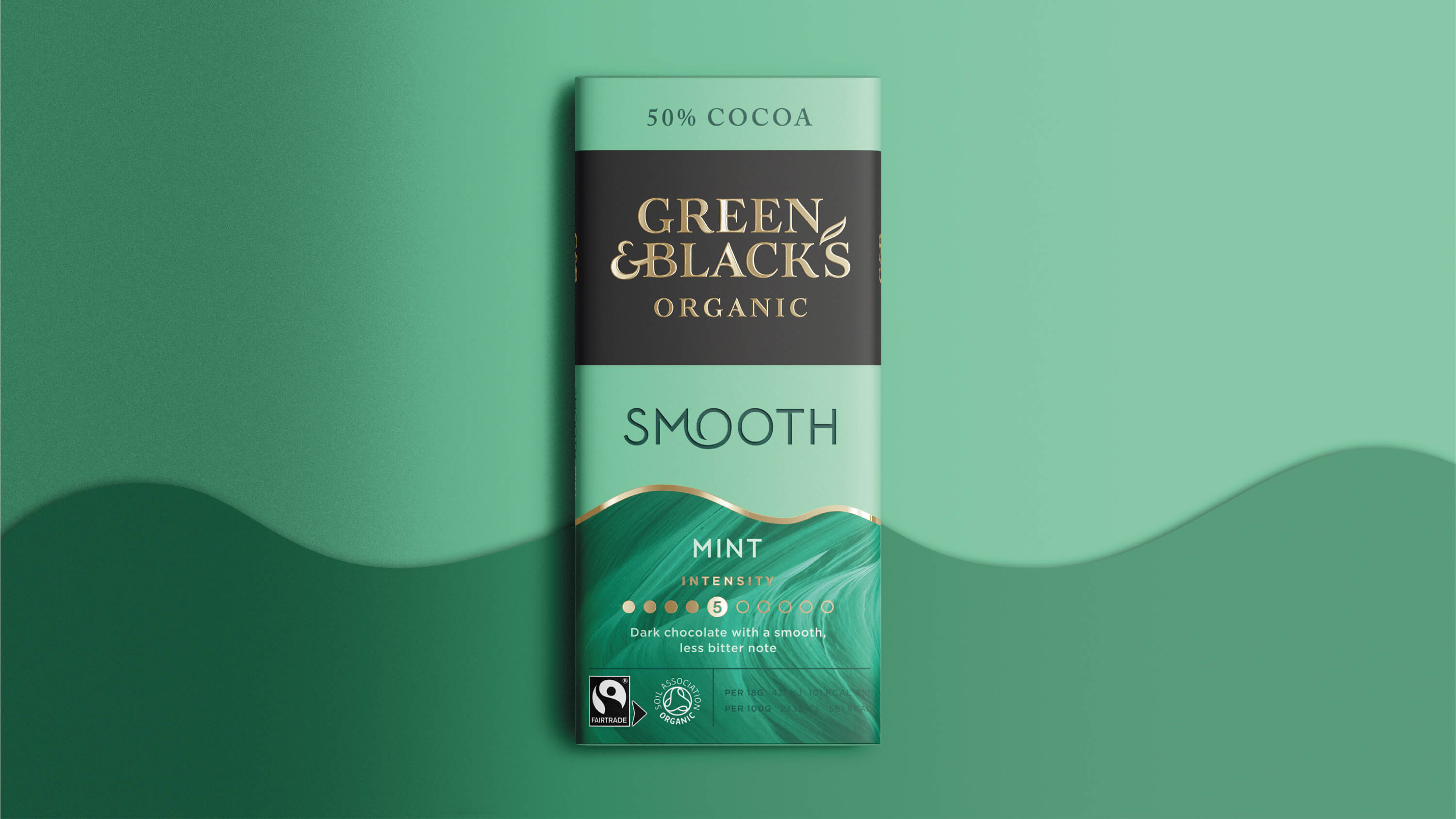
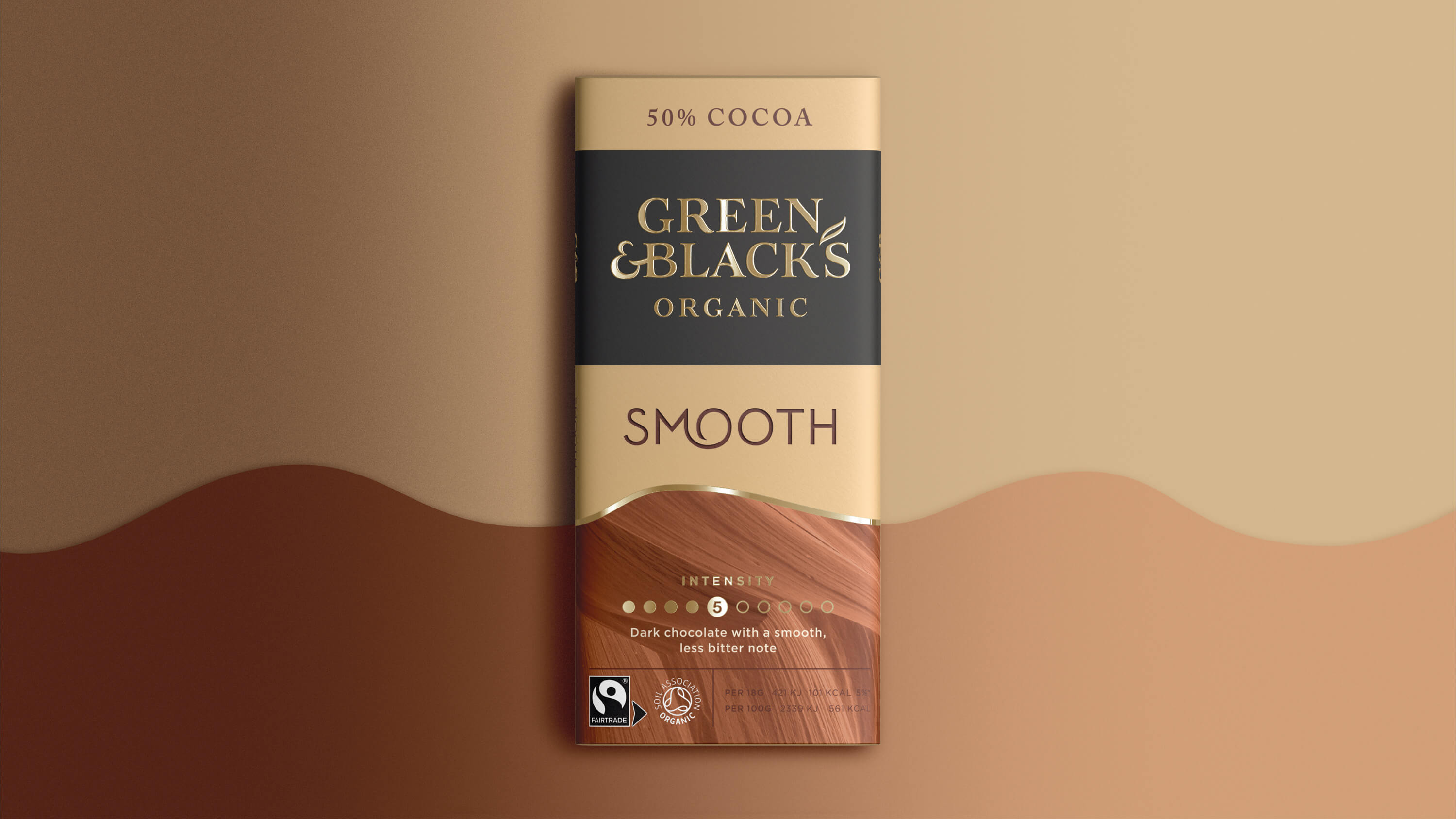
We played with contrasts between rough and smooth to bring the idea of a ‘Dark Chocolate with a smooth. less bitter note’ to life. A smooth curved line runs through and connects the packs and separates our beautifully smooth typography from a rugged, rougher texture representing the dark chocolate notes.
Unmistakably Green and Black’s, unmistakably Smooth.


